
University News
![[Download Print-Quality Image]](http://www.wiu.edu/images/news/17258/17258_9882_1.jpg)
WIU COVID-19 Dashboard & Map Hits 1 Million Views
June 17, 2020
MACOMB, IL – While the state is beginning its abbreviated re-openings of businesses, schools and more across Illinois, the COVID-19 pandemic remains at the forefront and numerous protocols are in place to continue to flatten the curve. To help keep citizens up-to-date with the latest statistics and information, the statewide COVID-19 web map and dashboard launched in mid-March by the Western Illinois University GIS Center, in cooperation with the Department of Earth, Atmospheric and Geographic Information Sciences (EAGIS) and the Illinois GIS Association (ILGISA), continues. And as of today (June 16), the map has had over 1 million views and remains the official public dashboard in Illinois, shared by state and federal agencies, as well as numerous news outlets throughout Illinois.
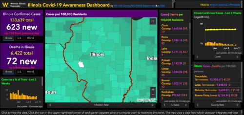
The dashboard initially began with map layers for Illinois and surrounding counties, and was quickly expanded to include every county and state in the U.S. for comparative purposes. Initially, indicator panels were included showing active cases and deaths for Illinois only.
"As the dashboard grew in popularity and the map layers were expanded nationwide, we added nationwide and global statistics, as well as additional map views. We've also added an informative, interactive infographic produced by Our World in Data that displays Covid-19 related deaths among countries to show how the United States compares to other countries through time. We actively monitor the growth of cases throughout the state of Illinois. Only Scott County is left as the only of Illinois' 102 counties without a reported Covid-19 case," explained WIU GIS Center Director and ILGISA President Chad Sperry.
According to Christopher Sutton, EAGIS cartography and GIS professor, as data related to COVID-19 became more accessible, the WIU team adapted the dashboard to include new information.
"When Gov. Pritzker's Restore Illinois program went into effect, we expanded monitoring of confirmed cases and deaths in the state to include testing. Because the number of confirmed cases can reflect the level of testing (i.e., more tests results in more confirmed cases), we added a chart showing cases as a percentage of the number of tests," Sutton added. "Thus, we are able to make more meaningful comparisons of the virus in Illinois over time. It additionally has shown us a substantial decline in the percentage of positive cases. In April, the state was regularly seeing 20-25 percent of tests coming back as positive. We've been under 10 percent since late May."
Data at the county level are reported by the Illinois Department of Public Health and respective agencies in states bordering Illinois. The map is updated once a day as the IDPH and other agencies release official reports. While the map data may lag slightly behind cases that are reported by news outlets, the information presented still remains relatively current.
To view the map, visit wiu.edu/illinoiscovidmap/.
Posted By: University Communications (U-Communications@wiu.edu)
Office of University Communications & Marketing
Connect with us: