
University News
![[Download Print-Quality Image]](http://www.wiu.edu/images/news/17359/17359_10009_1.jpg)
COVID-19 Dashboard
September 23, 2020
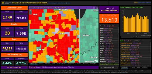
MACOMB, IL – As the COVID-19 pandemic continues throughout our state, the nation and the world, two Western Illinois University faculty members continue to refine a map created in mid-March to keep Illinois citizens up-to-date on the numbers of cases, recoveries, deaths and more. The statewide COVID-19 web map and dashboard, launched by the WIU GIS Center, in cooperation with the Department of Earth, Atmospheric and Geographic Information Sciences (EAGIS) and the Illinois GIS Association (ILGISA), is up to 1.3 million views.
In addition, WIU GIS Center Director and ILGISA President Chad Sperry and his center staff recently created a dashboard specifically for Western to keep track of COVID-19 data at the University, as well as a site for the McDonough County Emergency Services and Disaster Agency. Western's dashboard was created by the GIS Center using data and assistance from Beau Health Center, Utech and AIMS. A mobile version is also available at wiu.edu/covid-dashboard/mobile.php.
The statewide dashboard created by Sperry, GIS Center staff and EAGIS Professor Christopher Sutton initially began with map layers for Illinois and surrounding counties, and was quickly expanded to include every county and state in the U.S. for comparative purposes. Initially, indicator panels were included showing active cases and deaths for Illinois only.
"Along with many of the original features from the map's early beginnings in March, we now include COVID 'hotspots,' which are counties with an increase of at least 100 cases per 100,000 residents in the previous seven days, as well 'alert' counties, those with an increase of at least 50 cases per 100,000 residents," Sperry said. "Like the rest of the dashboard, this map layer is updated daily, revealing current trends. The map is dynamic, allowing users to see not only what is happening in Illinois, but hotspots around the country."
According to Sutton, as data related to COVID-19 has become more readily accessible in recent months, the WIU team has further improved the dashboard to include new information.
"In recent weeks we have made several design updates to improve the communication of statewide COVID-19 information. Additionally, we've added daily and running totals for tests and a new indicator showing the number of new cases during the past seven days. We also rank the counties both by infection rate and death rate," Sutton explained. "The most notable change to the dashboard has been the addition of a 'swipe map' function to the main map, which allows users to interactively reveal and hide a layer showing counties with recent growth in the number of cases."
Data at the county level is reported by the Illinois Department of Public Health and respective agencies in states bordering Illinois. The map is updated once a day as the IDPH and other agencies release official reports. While the map data may lag slightly behind cases that are reported by news outlets, the information presented still remains relatively current.
To view the map, visit wiu.edu/illinoiscovidmap/.
Posted By: University Communications (U-Communications@wiu.edu)
Office of University Communications & Marketing
Connect with us: